
My friend Mark insists there is little or no blending in America. We are not so much purple as a collection of reds and blues.
Who's correct? Who knows? Likely, everyone is correct.
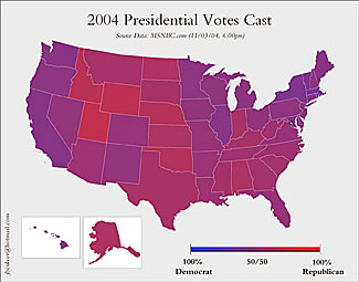
Reprinted from boingboing.net without permission
Purple Haze
Reprinted without permission
Wednesday, November 3, 2004
Reader Jeff Culver in Seattle says:
"I was thinking today about how the 'red v. blue' states graphic is really misleading considering the slim margins that the candidates won some of those states by, so I sat down and created the map that's attached. In the dozens of hours I've been watching the news I haven't seen one like it, but thought that you and the BoingBoing readers might find it interesting. I think it definitely portrays our fellow states far differently than the extreme way we've been seeing to date."
Link to full-size image. Nod also to Siege, who also thought of this months ago and posted a similar graphic on his blog at Nerve.
BoingBoing reader Bill says,
"In contrast to your purple map, USA Today has published a country map broken down by county that shows where each party won. It's an even more depressing sea of red than the full US map, but clearly shows how the city folk liked the Dems and the rural folk liked the Reps this time around. Population difference is slight, land area difference is huge."
1 comment:
This is the COmments feature at the bottom of each article.
We could move our discussions here, if you like.
Post a Comment